EVERGREEN
2024
SERVICES
branding, ui/ux design
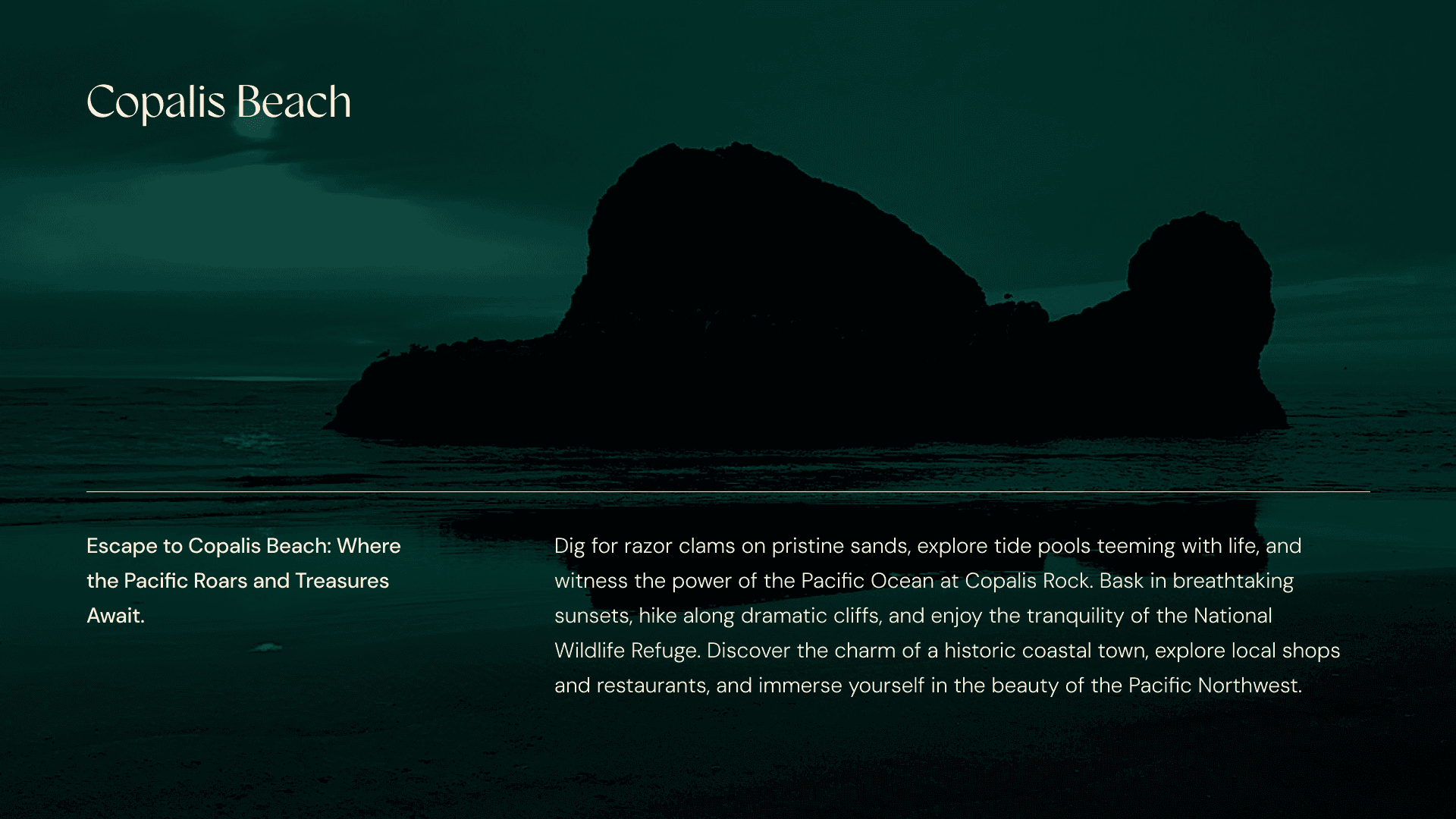
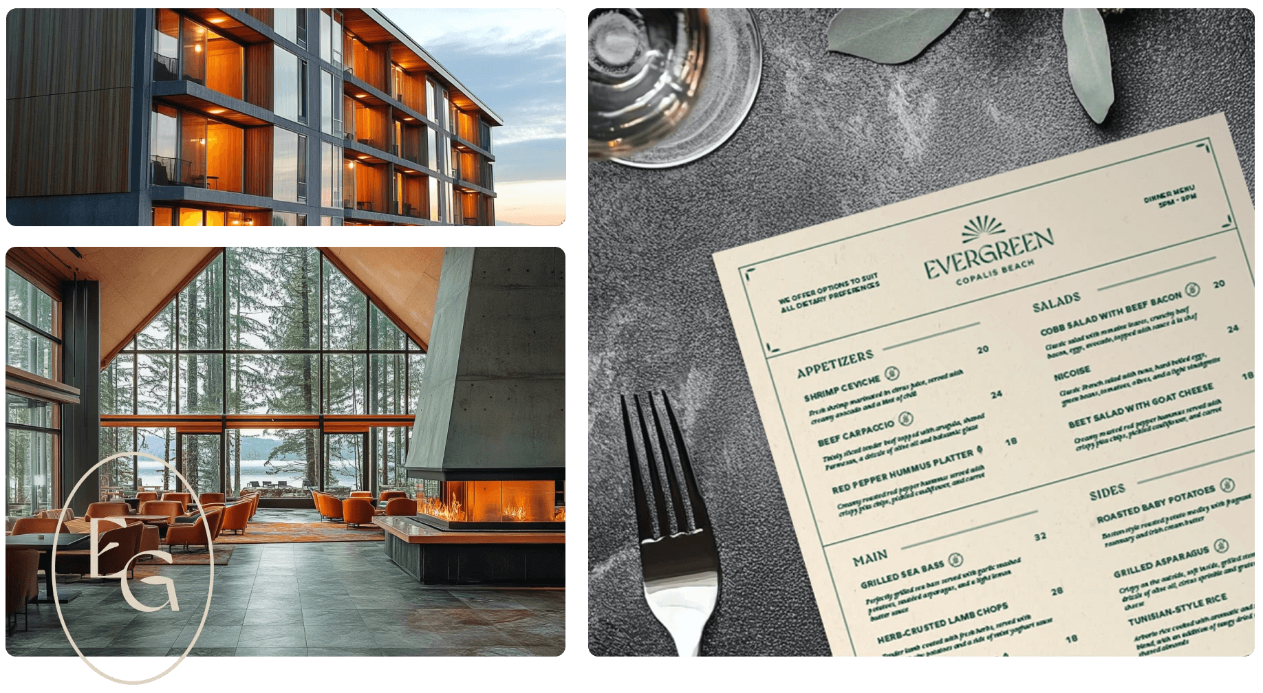
Evergreen is a new hotel and resort located in Copalis Beach, Washington. The concept centers around providing a luxurious yet nature-integrated experience, capitalizing on the area's stunning coastal beauty.
The branding played a crucial role in elevating this purpose. Instead of simply being another beachfront hotel, Evergreen's brand identity emphasizes sustainability and a deep connection to the surrounding environment.

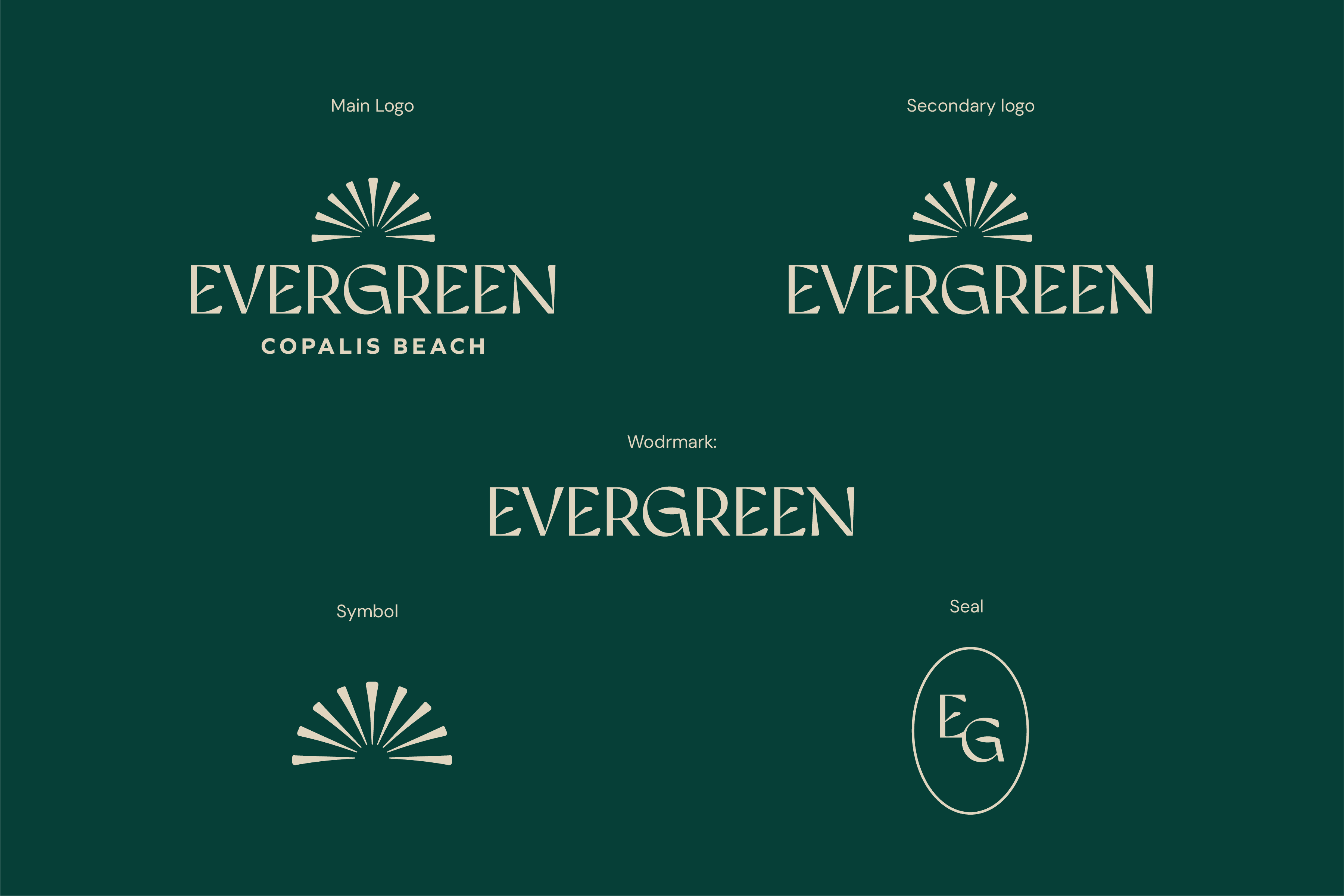
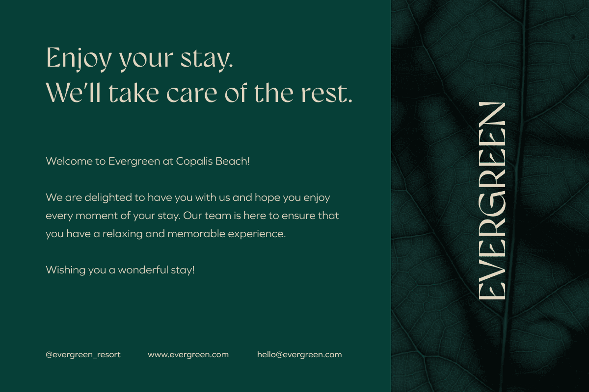
Several logotype versions were developed to help the company communicate its message clearly and effectively within different media. The wordmark, symbol, and seal offer flexible options for various space constraints. The seal can be also used for decorative purposes and as a supplementary design element.
During the development of a color palette, I made sure to lean onto natural tints that actually are present around Evergreen's location. Clean and contrast colors represent an "out in the woods" recreational experience.

Typography has been deliberately limited to two font families to eliminate confusion and ensure cohesive layout system throughout all branded materials.

Typography has been deliberately limited to two font families to eliminate confusion and ensure cohesive layout system throughout all branded materials.


For a mobile application, secondary research was conducted with a deep analysis of the existing practices for smart-home applications, inclusing surveys and focus groups interviews to identify main pain points experienced during stays.
Research has shown that users are highly enthusiastic about the concept of a smart room where they are able to control multiple devices from one place and request services. However, they express concerns about usability. They want easy access to controls.
Following the user journey mapping, the decision was made to bring all key elements to the home screen, allowing users to switch between tabs for extra features or additional services.
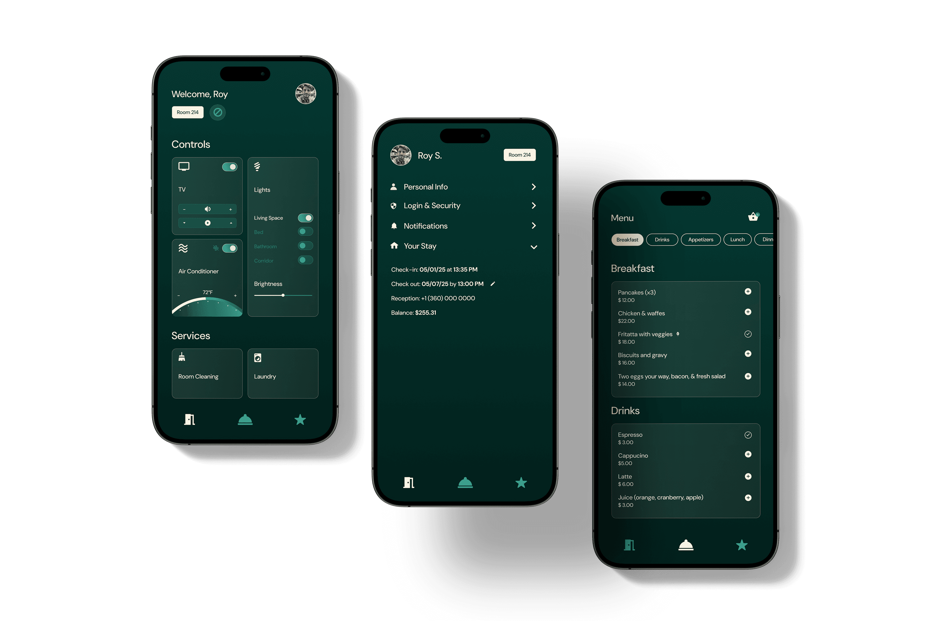
The simple interface lets users effortlessly navigate through the app. The contrast between the UI elements complies with WCAG standards, making the experience inclusive and reducing eye fatigue.
During the UX research, special attention was paid to gestalt principles in the UX design. Gestalt principles were incorporated through component grouping for common regions, layout grids for continuity, and consistent colors for similarity.
This approach has resulted in a strong and cohesive visual hierarchy.